By Vanessa Sky at vanessasky.com
Branding starts with a good look and having a catchy logo is essential.
Here's how I created a simple and sweet logo.
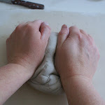
I started with what I make, sculptures. Mostly trees with a funny shape.

So I began drawing dozens of trees with this shape, keeping it simple and clear. I wanted it to be easily readable 10 pixels high and in black and white.
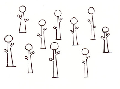
I picked my favorite tree.

I then drew my name, including the tricky s's.

I scanned them, cleaned them up, and put them together.

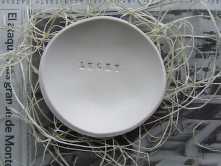
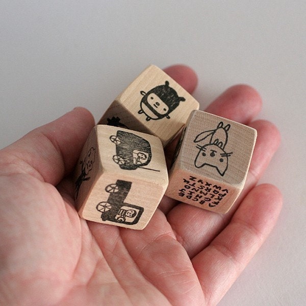
I loved that white space. Then I sent them out to make rubber stamps since I wanted to stamp it into clay for more texture. You can use the stamps to brand your packaging. Here is where I get my stamps.

This was the look I wanted. I had the foundation of my brand and you can see the logo in action here.
If you would like to read some more on logo's and design resources, check out these sites:
Some beautiful logos using negative pace - this is what professional Graphic Designers can do!
Graphic Design Association, they have standards if you are looking to hire a Graphic Designer - AIGA
Some artists with simple and sweet branding:

Any other artists that you love the look of?